
Branding and Web Design for Nabara Psychology

In collaboration with Psicología Nabara, I led a comprehensive project for brand development and online presence. From conception to implementation, I worked closely with the client to define the corporate branding, including the logo shape, typography, and distinctive color palette. Additionally, I was responsible for the design and programming of the website, ensuring it was not only visually appealing but also functional and optimized for search engines (SEO). This project encompassed various elements, from web design to mobile adaptation, as well as the creation of business cards and other corporate items. The provided images offer a detailed insight into this end-to-end process, highlighting the cohesive and professional aesthetic achieved for Psicología Nabara.
Check the website here: www.psicologianabara.com Release date: Jan 2024 |
|
Virtual Reality- UI design

|
I am pleased to share my user interface (UI) design project, in which I crafted a concept for a virtual reality website. I opted for dark tones and futuristic shapes to emphasize the company's style. The design encompasses sections such as the Home page, About Us, Contact, and FAQs. The black and white ambiance creates a sophisticated and cohesive atmosphere. Additionally, I implemented a lateral scrolling with reference points, akin to modern Apple websites, for a sleek and contemporary browsing experience.
Release date: Jun 2022 |
|
Branding for Clinic Heilen

I embarked on a comprehensive branding project for Clinic Heilen, encompassing everything from their logo to website and business cards. The chosen aesthetic was clean, characterized by white and purple tones that aligned with the client's vision for their medical aesthetic business. Given the emphasis on elegance, relaxation, and simplicity in this field, I designed a full company name logo alongside a simplified icon for use in signatures and staff uniforms. The business cards took two forms: an informative one with the director's details and another for appointment reminders. A flyer detailing treatments was also crafted, mirroring the same elegant and simple design with consistent hues. The resulting design is both uncluttered and organized, ensuring legibility and appeal to a diverse clientele.
Release date: May 2023 |
|
SMOOTHIES AND FRUITS - ui design

|
I'm excited to share my UI project, where I designed a potential website for a smoothie and fruit shop. The web design is centered around vibrant summer colors and abundant fruit and smoothie imagery to captivate users looking to indulge in a refreshing drink. I incorporated playful and curvy shapes to mimic the fluidity of the beverages. The entire web design spans from the inviting Home page to the FAQ section and even promotional offers.
The design strikes a balance between cleanliness and fun, with clear and eye-catching prices that allow users to quickly identify their desired choice. Every aspect of this website aims to provide an effective and attractive platform for selling products. Whether it's a refreshing fruit blend or a vibrant smoothie, the design is tailored to entice customers and enhance their shopping experience. Release date: May 2021 |
|
Personal Business card

In my graphic design project, I crafted my business cards with an elegant style and soft colors. I decided to incorporate triangle shapes as the central element, creating the illusion that the 3D forms are constructed using triangles. I designed a real image reimagined with a composition of triangles, achieving the effect of a 2D image with a low poly 3D style, while still maintaining its flat appearance. For added impact, I chose to print the image with beveling and a glossy finish, capturing attention in a striking manner, as showcased in the accompanying video. Altogether, these features came together to form a captivating and sophisticated business card, perfect for making a lasting impression on clients.
Release date: March 2023 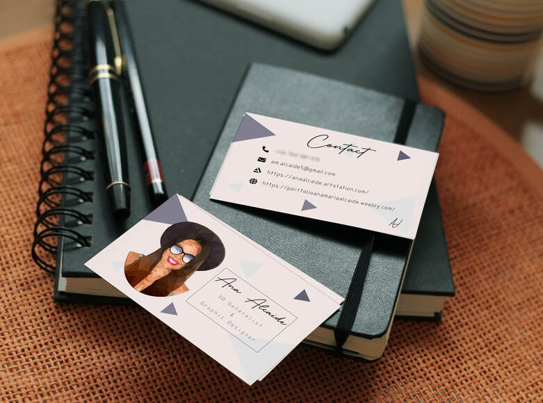
|
|
Branding for Around the Corner

I led an exciting branding project for the company "Around the Corner," completely transforming its image. I began by designing business cards based on their original colors of brown, blue, and gray. Through several sketches, we explored concepts featuring hexagons and cards with a broken design, although the initial sketch prevailed. Later on, to increase visibility, I updated the logo with an icon while retaining its recognizable essence. The new color palette includes vibrant oranges and intense blues, infusing the company's identity with dynamism. Now, the icon reinforces instant brand recognition, giving "Around the Corner" a fresh and appealing image.
Release date: May 2023
|
|
Logo Redesign

I undertook a logo overhaul, infusing it with a touch of seriousness while preserving its playful "cartoon" essence. Through the art of 2D caricature and strategic triangular accents, I ingeniously conveyed my commitment to the 3D realm, where shapes are intricately woven through triangular polygonal structures.
Release date: May 2022
Release date: May 2022
Old logo |
New logo |
image retouching techniques

I have a strong command of Photoshop, applying advanced techniques such as double exposure and matte painting to achieve visually stunning compositions. Double exposure merges two images to create a unique and evocative narrative, while matte painting allows for the creation of astonishing digital landscapes. Furthermore, I can revitalize old or damaged images, using Photoshop's restoration tools to bring back their original splendor, and perform a wide range of retouching and enhancements as required by the project.
Release date: 2019
Release date: 2019
Double exposition |
Matte painting |
|
Vertical Divider
|
Follow and contact me
|
